


Marco Melgrati illustrates the times in which we now live. Words: Luiz Sanchez.

People say art is subjective, that the meaning of art is not beholden to the artist. People often look at the statue of the Fearless Girl standing in front of the Charging Bull statue in Wall Street as a work of defiance to Wall Street. Fun fact, the Charging Bull was a guerilla installation meant to depict the strength and power of the American people after the 1987 stock market crash, but is today commonly seen and criticized as a symbol of Wall Street’s bullish nature. The Fearless Girl on the other hand was an art installation commissioned by one of the world’s largest asset management corporations as an advertisement for an index fund comprised of gender diverse companies, but is seen as a symbol of resistance against Wall Street and of female defiance.
In the 21st century perhaps more than ever before, we not only look for meaning within a work of art, but we also look to criticize the artist for our own interpretation of their work.
I met with Marco Melgrati, an Italian illustrator whose work frequently criticizes our modern technological society. Many often assume he has something to say about the world, and discuss, dissect, and criticize his message. But hold on, Marco would say. Take a step back and ask yourselves if what you are criticizing is the intended message, or your own projection on the product.
Most of Marco’s work is commissioned. He is not an artist in the traditional sense, producing work which then gets sold. “I am an illustrator,” he clarified. “Most of my work is commissioned. I am given an article and told to design illustrations that will fit that article. Sometimes the illustrations they want just happen to fit into my world view but as an illustrator I do not have total freedom to design what I want.”
Typically, Marco will make three sketches based on the article for which it is commissioned, and the editors choose the idea they like best. His process is very mechanic. He identifies key points in the article, designs symbolic representations for those points, and incorporates them into the final product.

While it may sound like a job is simply a job, Marco does have his limits and his morals. “I don’t work for publications that are too extreme to the left or the right,” he explained to me. “If a far-right outlet asked me to do an illustration that was antisemitic for example, I would not do it.” Work however, is work. Disagreeing with the message is not the same as opposing it fundamentally. As such he has done work which he has disagreed with, but that is the nature of the industry.
“I recently did an illustration for an article about toxic masculinity,” he explained. “The premise of the article was that toxic masculinity does not exist, because masculinity itself is toxic. The article essentially argued that even the best men are deep down rapists and misogynists, and I strongly disagreed with it, but the work had been commissioned by an agent I worked with and by the time I was given the content of the article the invoice had already been sent. If I knew in advance, I would have turned it down but I am a professional. At that stage of the process I couldn’t turn around and say no anymore.”
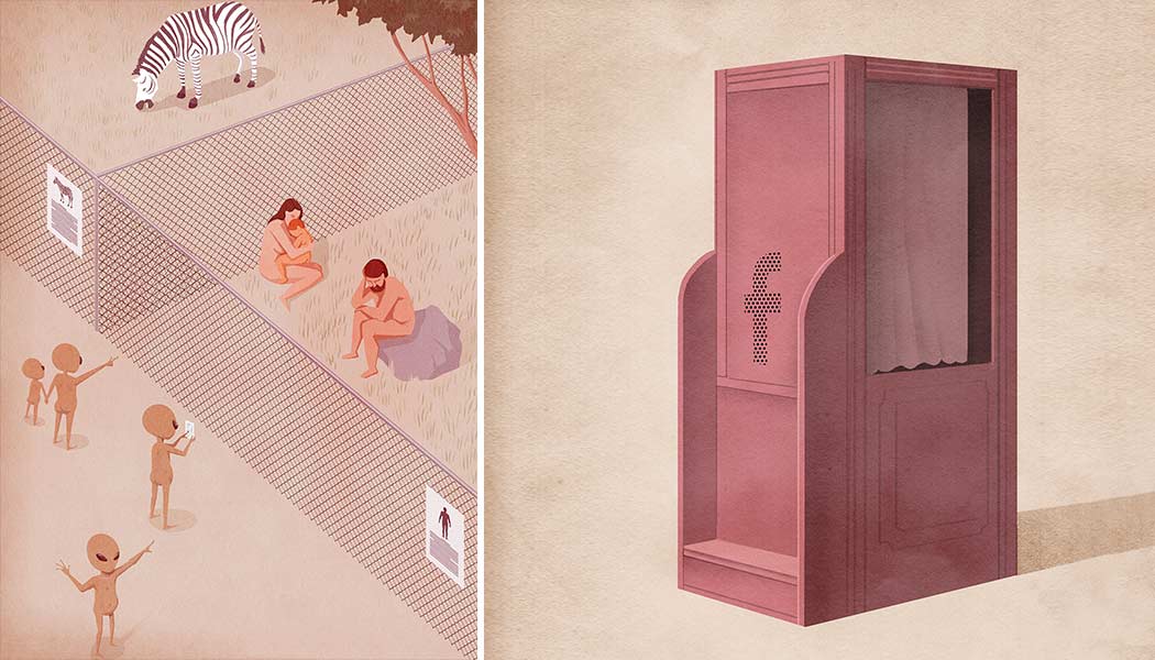
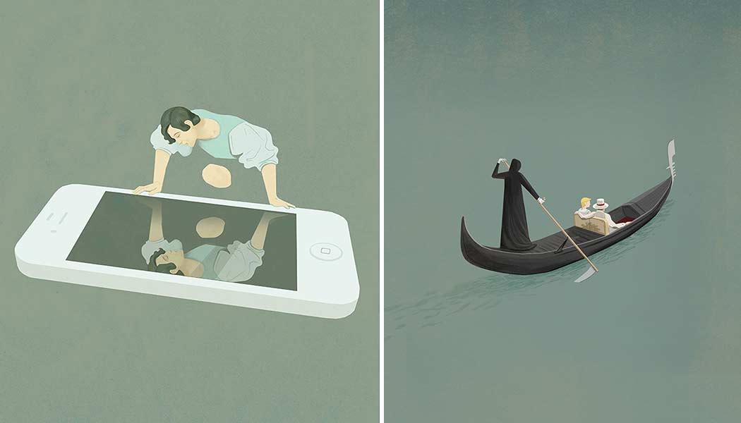
Marco’s work is very smart. It is full of symbolism and has a surreal quality to it that really resonates with me. One of his recent pieces featured a racially ambiguous man holding a cellphone with his shadow cast on a wall beside him. The phone on the shadow was portrayed as a flaccid penis, with the central thesis being about how pornography addiction leads to sexual dysfunction among men. Apparently, this was taken by some people on the internet as a weak jab at Asian men having small penises. “A lot of people get easily offended nowadays, and I think this is a problem,” he explained.
Marco has had to navigate these issues several times before. He recently made an illustration for an English magazine article about skin defense. He came up with the idea to make a medieval suit of armour using pink as its colour, as saturated pink lends itself really well to surrealist art. “The editors had a problem because they wanted me to use brown so as to not seem racist. But brown is not so surreal. In the end we came up with a compromise and I think it worked out well.”
The French theorist Roland Barthes once wrote an essay called the Death of the Author. In it he argued that the author and their writing are unrelated, that criticism of a work should be divorced from the author’s identity. Today however we have moved beyond criticizing art based on its creator’s identity, and instead have moved to criticize the creator based on our own interpretation of their art.

“I always try to make an image that is not too obvious so that it is not propaganda,” Marco explained. “In the end I try to make something that hints at the point of the article but is open to interpretation. People are so easily offended. If you are so full of stereotypes, if you are so ready to see offence … you will always be offended.”

